A Guide to Print Colors: CMYK, Pantone and RGB Made Simple
What Are Print Colour Systems?
Choosing the right colour system is one of the most important steps in packaging and print design. If you’ve ever wondered why colours on screen don’t match what comes out of the printer, the answer usually lies in understanding CMYK, Pantone, and RGB.
In this guide, we break down each colour system in simple terms, explain when to use them, and help you get the best possible results for your packaging and printed materials.
Colour systems (or colour modes) are different ways of creating and reproducing colour. The three most common are:
-
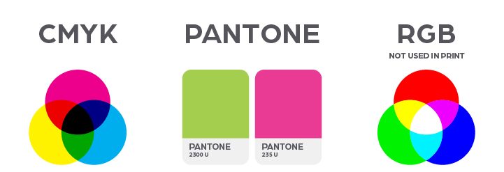
CMYK – used for most commercial printing
-
Pantone (PMS) – used for precise, consistent brand colours
-
RGB (HEX codes) – not used in printing, used for digital screens only
Each has a different purpose, and using the wrong one can lead to colour mismatches, dull prints, or unexpected results.
What is CMYK?
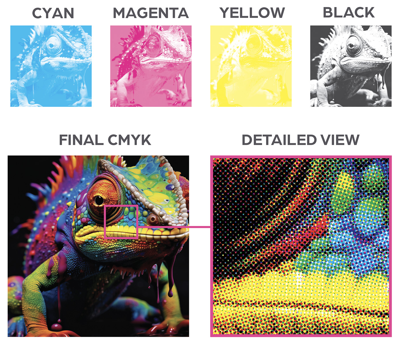
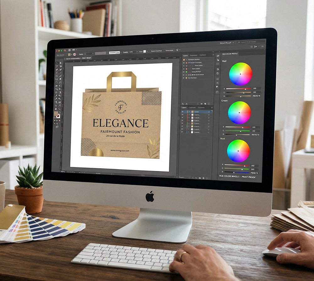
CMYK stands for Cyan, Magenta, Yellow, and Black. It is the standard colour model used in most packaging and print production.
How CMYK Works
CMYK uses a process called four-colour printing, where tiny dots of each ink are layered to create a full spectrum of colours.
When to Use CMYK
-
Packaging printing
-
Brochures and flyers
-
Labels and cartons
-
Any high-volume print jobs
Pros of CMYK
-
Widely supported across all printers
-
Ideal for full-colour images
Considerations
-
Shades can differ depending on material, coating and machine type
-
Not always the best path for brand-specific colours
-
Cannot reproduce some very bright or neon tones
What is Pantone (PMS)?
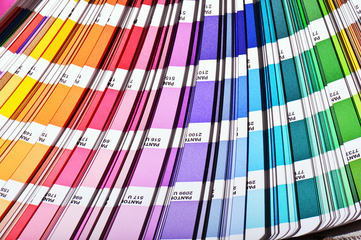
Pantone, also known as the Pantone Matching System (PMS), is a standardised colour system used to ensure exact colour consistency.
How Pantone Works
Each colour is pre-mixed and assigned a unique code (e.g. Pantone 186 C). This ensures that the same colour looks identical, no matter where or how it’s printed.
When to Use Pantone
-
Brand logos and identity colours
-
Premium packaging
-
Corporate materials
-
When colour consistency is critical
Pros of Pantone
-
Exact colour matching every time
-
More consistent than CMYK across different materials and printers
-
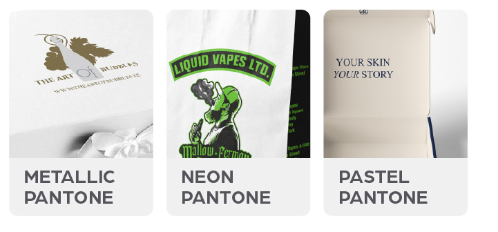
Can achieve colours CMYK cannot (e.g. metallics, fluorescents)
Considerations
-
Not the best option for image-heavy designs
-
Limited to specific spot colours
What is RGB?
RGB stands for Red, Green, and Blue. It is the colour system used for digital screens such as phones, laptops, and TVs.
How RGB Works
RGB creates colours by combining light, rather than ink. This allows for brighter and more vibrant colours than print can achieve.
When to Use RGB
- Websites and eCommerce
- Social media graphics
- Digital packaging mockups
- Online marketing materials
Pros of RGB
- Vibrant, bright colours
- Ideal for digital use
- Wide colour range
Limitations
- Not suitable for printing
- Colours often appear duller when converted to CMYK
- Can cause unexpected results if used in print files
Which Colour System Should You Use?
Choosing the right system depends on your project:
-
Use CMYK for most packaging and print jobs
-
Use Pantone when brand colour accuracy is critical
-
Use RGB for anything digital
In some cases, a combination is used - for example, a CMYK design with a Pantone colour for a logo.
How Many Colours Does Your Packaging Need?
1-Colour Print
A single colour printed on the packaging - usually a spot Pantone or a solid CMYK ink. This is the most cost-effective option and works well for simple, clean branding.
Good for: logos on kraft bags, one-colour tissue paper, simple text or icon on plain packaging, entry-level branded bags where budget matters.
Things to know: There are no colour mixes or gradients - what you see is a flat, solid ink. The background is the material itself (kraft brown, white, black), so material colour becomes part of the design.
2-Colour Print
Two separate inks are used - typically a primary brand colour plus a second accent, or a dark ink on a coloured stock. This opens up more design options while keeping costs lower than full colour.
Good for: packaging with a logo plus a text colour, two-tone brand designs, premium bags that need more presence without full-colour pricing.
Things to know: Still uses spot inks in most cases, so Pantone references are important. Gradients between the two colours are not possible without halftone screening.
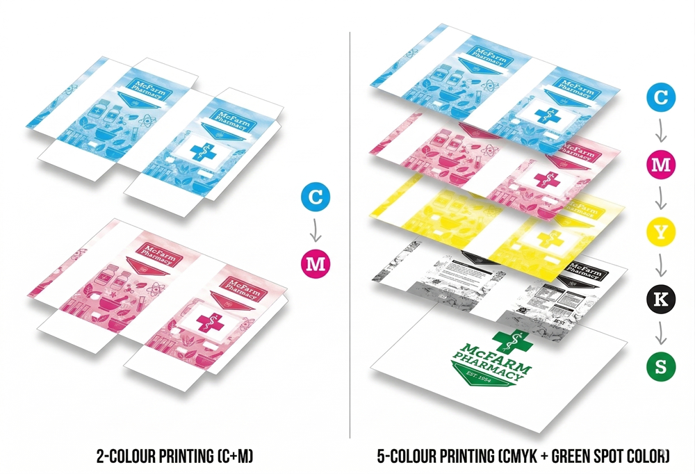
4-Colour Print (Full CMYK)
The standard for full-colour packaging. Four ink plates - Cyan, Magenta, Yellow, and Black - combine to reproduce photographs, complex artwork, and any design with gradients or multiple colours.
Good for: packaging with product photography, multicoloured illustrations, or any design that uses more than two or three flat colours.
Things to know: This is where the RGB-to-CMYK conversion matters most. Artwork should be supplied in CMYK, not RGB, to avoid colour shifts at press. Very bright or neon tones may not reproduce exactly.
5-Colour Print (CMYK + 1 Spot)
Four-colour process printing with an additional spot ink - usually a Pantone colour for a brand logo, a metallic, or a fluorescent tone that CMYK cannot reliably reproduce.
Good for: premium branded packaging where the logo or a key brand colour must be exact, even within a full-colour design. Common for retail packaging, gift bags, and branded boxes where the brand colour is critical.
Things to know: The fifth colour adds to cost and press time, but it solves the most common brand colour complaint - the logo looking slightly different from your Pantone standard. If your brand has a specific colour that matters, a 5-colour job gives you the best of both worlds: full-colour imagery plus a guaranteed brand match.
Common Misunderstandings About Print Colour Differences
One of the biggest frustrations in print and packaging is when colours don’t look exactly the same from screen to final print - or even between two separate print runs. This is usually not a printing error, but a result of how different colour systems and processes work.
✔ Digital and printed use different color systems. Screens show color with RGB light, while printers reproduce color with CMYK ink, so the same design can look brighter on screen and duller on paper.
✔ RGB colors often cannot be printed exactly. Many vivid blues, greens, pinks, and neon tones sit outside the CMYK gamut, so the printer has to use the closest available mix.
✔ Pantone is not the same as CMYK. Pantone uses pre-mixed spot colors for more exact matching, but a Pantone color still may shift if it is converted to CMYK instead of printed as a spot ink.
✔ Digital proofs are only a guide. A proof on a monitor depends on screen calibration, brightness, and color profile, so it will not perfectly match a physical print every time.
✔ Printer type changes the result. Offset, digital, and large-format printing all handle ink differently, so the same file can print differently depending on the process.
✔ Paper and print material affect color. Coated paper, uncoated paper, labels, packaging boards, and other substrates absorb ink differently and can change how a color appears.
✔ Finishes can shift the final look. Lamination, varnish, and other coatings can make colors look glossier, darker, or slightly changed after printing.
✔ Lighting changes color perception. A print viewed under warm indoor light, daylight, or store lighting can look different even though the ink itself has not changed.
✔ Color guides and references are not permanent. Printed color guides can fade or become outdated over time, so older guides may no longer match current production conditions as well as fresh references do.
✔ Monitor calibration matters. A poorly calibrated display can make the proof look more accurate than it really is, which leads to surprises when the job is printed.
We do our best to match your brand colors accurately, especially when you provide:
✓ Pantone codes
✓ CMYK print specifications
✓ High-resolution artwork files
If exact color matching is critical, we recommend ordering a physical sample before full production.
10 Questions We Always Encourage Our Customers to Ask About Colour in Branded Packaging
1. Is your logo artwork set up in the right colour mode for print? This is the first thing we check when a new artwork file comes in. Most logos are originally designed in RGB for screen use, and files sent straight from a website or social media are almost never print-ready. Before we go anywhere near a press, we need your artwork in CMYK - or with confirmed Pantone references attached. Catching this early saves everyone time and avoids colour surprises on finished packaging.
2. Do you have a Pantone code for your brand colour? You'd be surprised how often customers come to us with a colour described as "our shade of green" or "a warm navy" with nothing more specific than a screenshot or a photo of an old bag. Without a Pantone code, we're essentially guessing-and so is every other supplier you'll ever use. If you don't have one, we can help you find the closest current match, but getting it properly defined and written into your brand guidelines is one of the best investments you can make early on.
3. Have you seen what your Pantone colour looks like converted to CMYK? This catches a lot of customers off guard. Pantone colours are pre-mixed inks - when we convert them to a four-colour CMYK process for full-colour printing, some shades shift noticeably. Bright oranges, certain purples, and vivid blues are the most common culprits. We always recommend checking a printed CMYK swatch on your actual material before signing off on a full production run, so there are no unwelcome surprises when the boxes arrive.
4. Do you know how many print colours your design uses? A design that looks clean and simple on screen can involve more colours than expected once you account for gradients, background tints, and fine detail. The number of colours directly affects your price per unit and the print process we recommend. Whether your job suits 1-colour, 2-colour, full 4-colour CMYK, or a 5-colour CMYK-plus-spot setup is something we work through with every customer - because getting that right from the start saves cost and avoids disappointment.
5. Have you considered how your packaging material will affect your colours? We print on a wide range of materials- kraft brown paper, white coated board, uncoated stock, matte laminate, and more - and the same ink values can look quite different depending on the surface. A warm cream on uncoated kraft reads very differently to the same colour on white gloss board.
6. Does your design include a finish, and have you seen how it affects your colours? Matte lamination tends to deepen and slightly dull colours. Gloss lamination makes them pop and intensifies saturation. Soft-touch coatings shift tone again. If your packaging has any kind of surface treatment applied after printing - and many of our premium bags and boxes do - we encourage customers to see a finished sample before full production, because the colour you approve at proof stage is not quite the colour you'll see once the finish is applied.
7. Do you know what colour variation to expect between orders? We're always honest with our customers about this: no two print runs are perfectly identical. Ink density, ambient humidity, press speed, and even the batch of material can introduce small variations. We work to tight tolerances and retain sealed approved samples from first production runs to match future orders against - but it's worth asking any packaging supplier how they manage this, and what their accepted tolerance actually is.
8. Have you asked for a physical proof before full production? We strongly encourage this for all first-time orders and any job where colour accuracy is critical. A PDF proof or digital mockup is useful for checking layout and copy, but it tells you very little about how your colours will actually print. A physical pre-production sample on your real material is the only way to be certain before committing to a full run. It adds a little time and cost, but it's far less disruptive than a reprint.
9. Are your brand colour specifications written down and stored somewhere safe? We hold customer colour specifications on file once a job has been approved, but we also encourage every customer to keep a written record of their own - Pantone code, CMYK values, and hex code - as part of their brand guidelines. Pantone fan decks fade over time, screens drift, and designers change. Without a reliable written reference, brand colour consistency becomes harder to maintain with every passing year and every new order.
10. If you add new packaging products in the future, how will you keep the colours consistent? Brand colour drift is one of the most common issues we see - a bag from two years ago, a box ordered last month, and a tissue sheet from a recent run can all look slightly different if each order is set up in isolation. We keep approved colour records for our customers precisely to prevent this. When you're ready to expand your range, we use your original approved standard as the reference point, so your full packaging family stays consistent and your brand looks intentional rather than accidental.